Popolopol Winery
BRAND STRATEGY, NAMING, DESIGN STRATEGY, CREATIVE DIRECTION
Popolopol began as a personal experiment — a self-commissioned project to create a wine brand from scratch. Being a complete novice in winemaking, without prior knowledge or experience, it took a great effort to get deeply involved in the topic and manage to produce a reasonably drinkable wine — which turned out to be much more than that.
Popolopol is a winemaking project developed by me and my friend, born out of the ritual — of sharing a bottle of rosé while catching up and sharing intimate novelties in life. Besides the wine, being friends from high school and sharing moments is a great part of our lives. The same goes for many other people, so this insight was the foundation for the brand name development.
Part of the brand culture and one of its main pillars is to preserve the bits of laid-back Mediterranean culture and various habitual and traditional activities that are vanishing from everyday life in the 21st century. Small-batch winemaking for personal consumption is one of them.
Popolopol is a wordplay in the Croatian language. “Po-pol,” shortened from “po pola,” means to share something in half, in equal parts. On the other hand, “opol” is a local word for rosé wine in Croatia, especially in coastal vernaculars. So, the name literally means to share a bottle of rosé (or any other wine) with a dear friend.
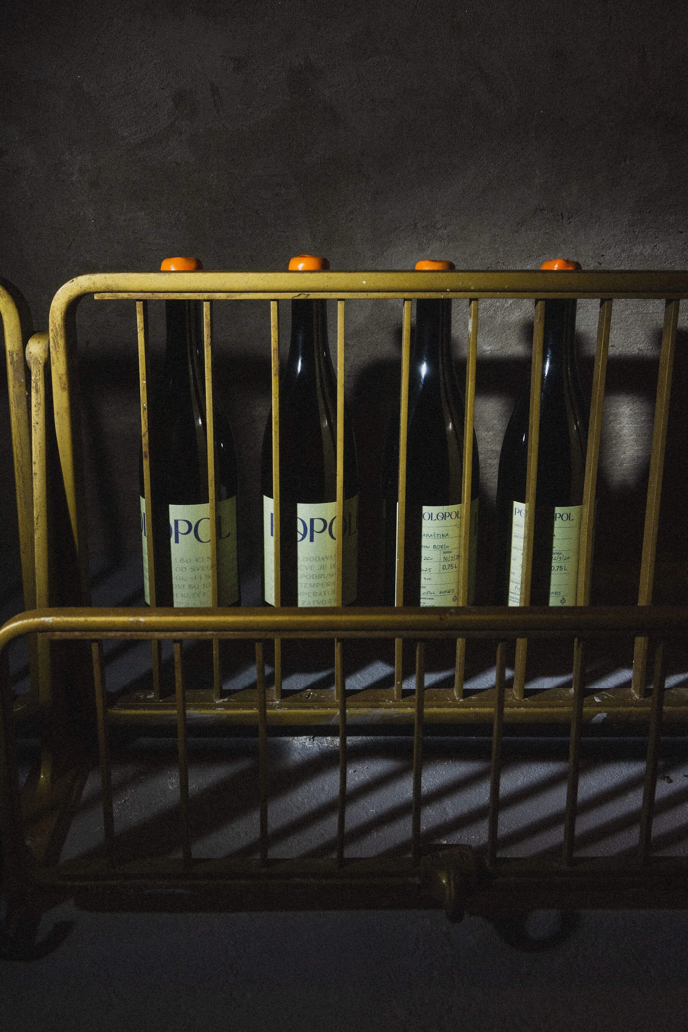

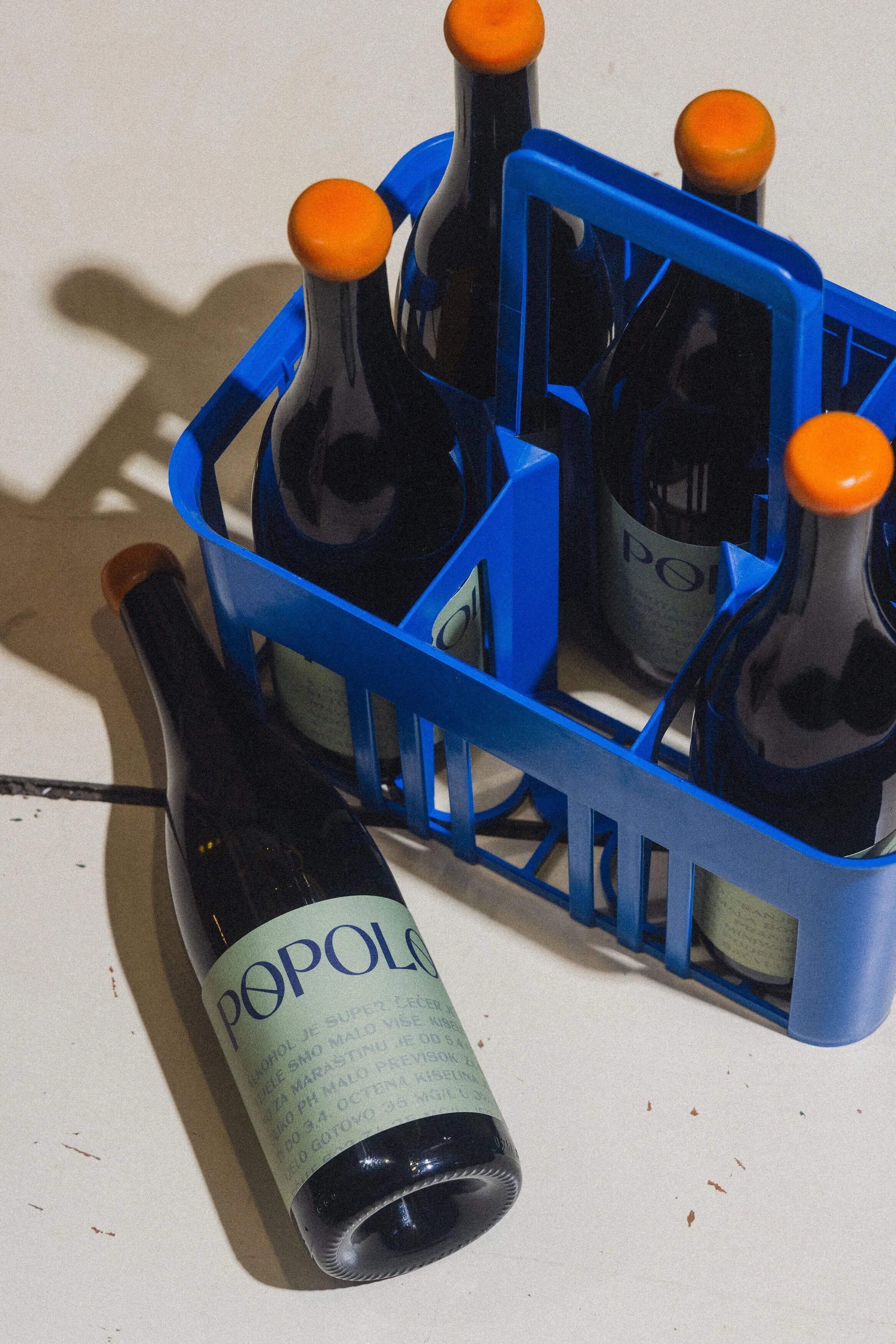
Never having made wine before, our endeavour sparked scepticism among people who weren’t convinced of a good outcome, nor did it ignite a desire to try it. This lack of trust became a creative platform for the bottle label design. We realised we needed a credibility tool to prove to people that we knew what we were doing. Every step of the thoroughly researched winemaking process was noted down in our winemaking journal, with all the measurement results — from sugar, acidity, and SO₂ levels to changes in taste, smell, and colour.
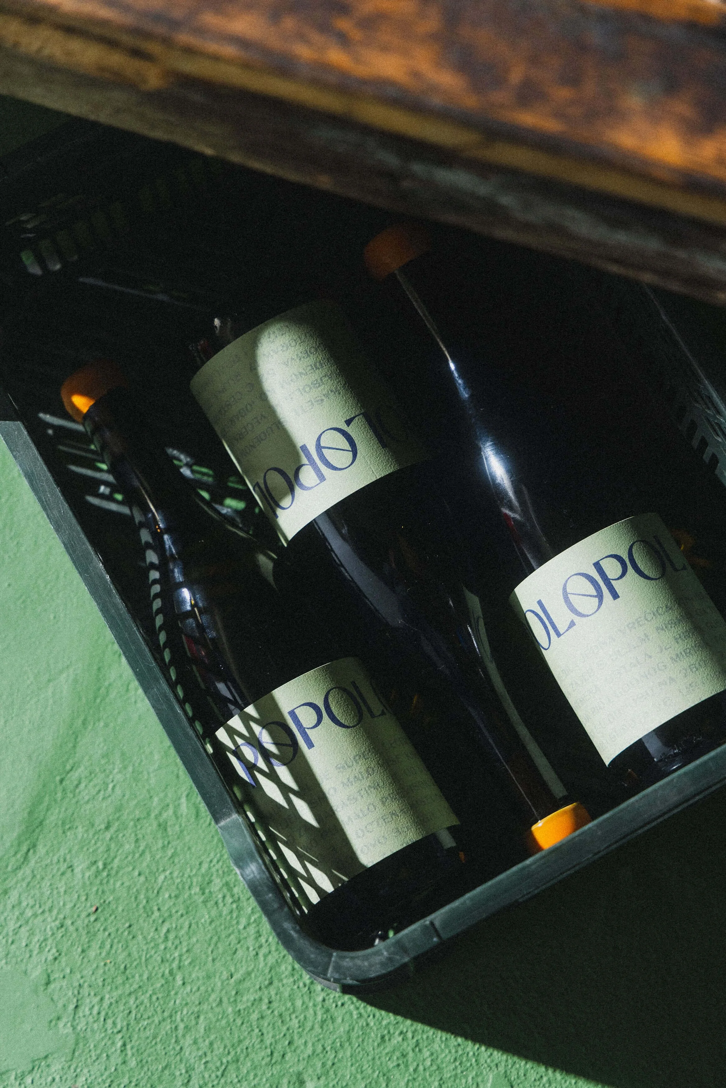
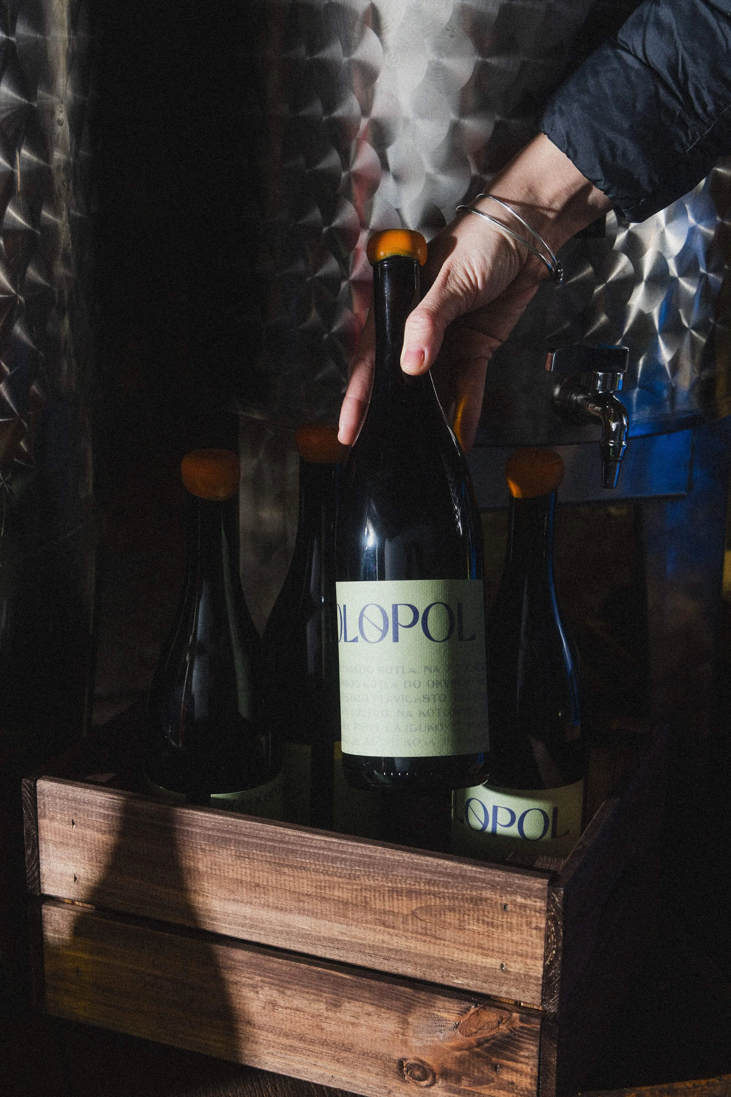
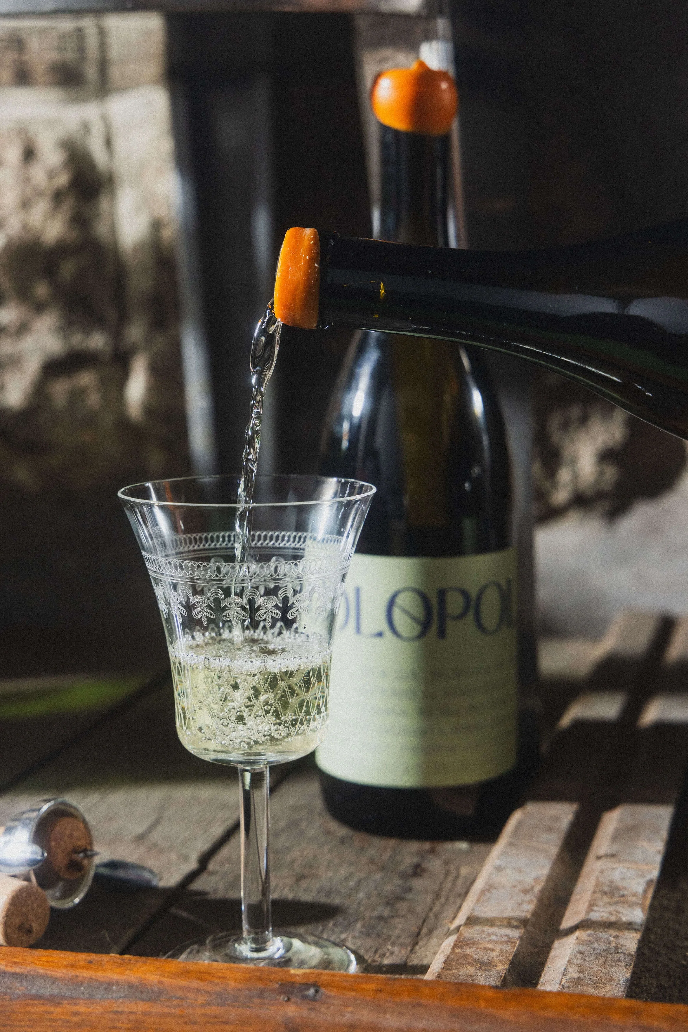
The journal, cut into fragments, became our graphic element for the label design — 46 bottles make one journaling cycle, and each of them carries a paragraph. When lined together, 46 bottles reveal the winemaking history and recipe of the first vintage. The back label carrying the information was incorporated into the main label and designed as a vintage warehouse form or receipt pad to be filled out by hand. The green colour of the label is a reference to the green floor of our wine cellar, while the orange wax cap is a reminiscence of the 1960s and 1970s vibe of Mediterranean culture and visual aesthetics.

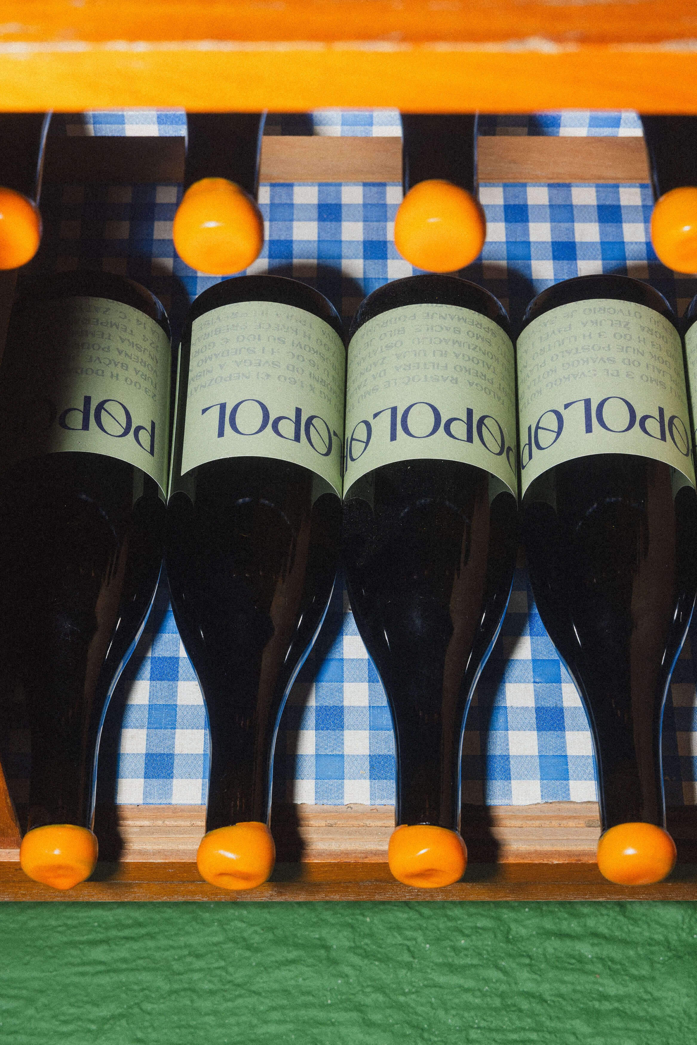
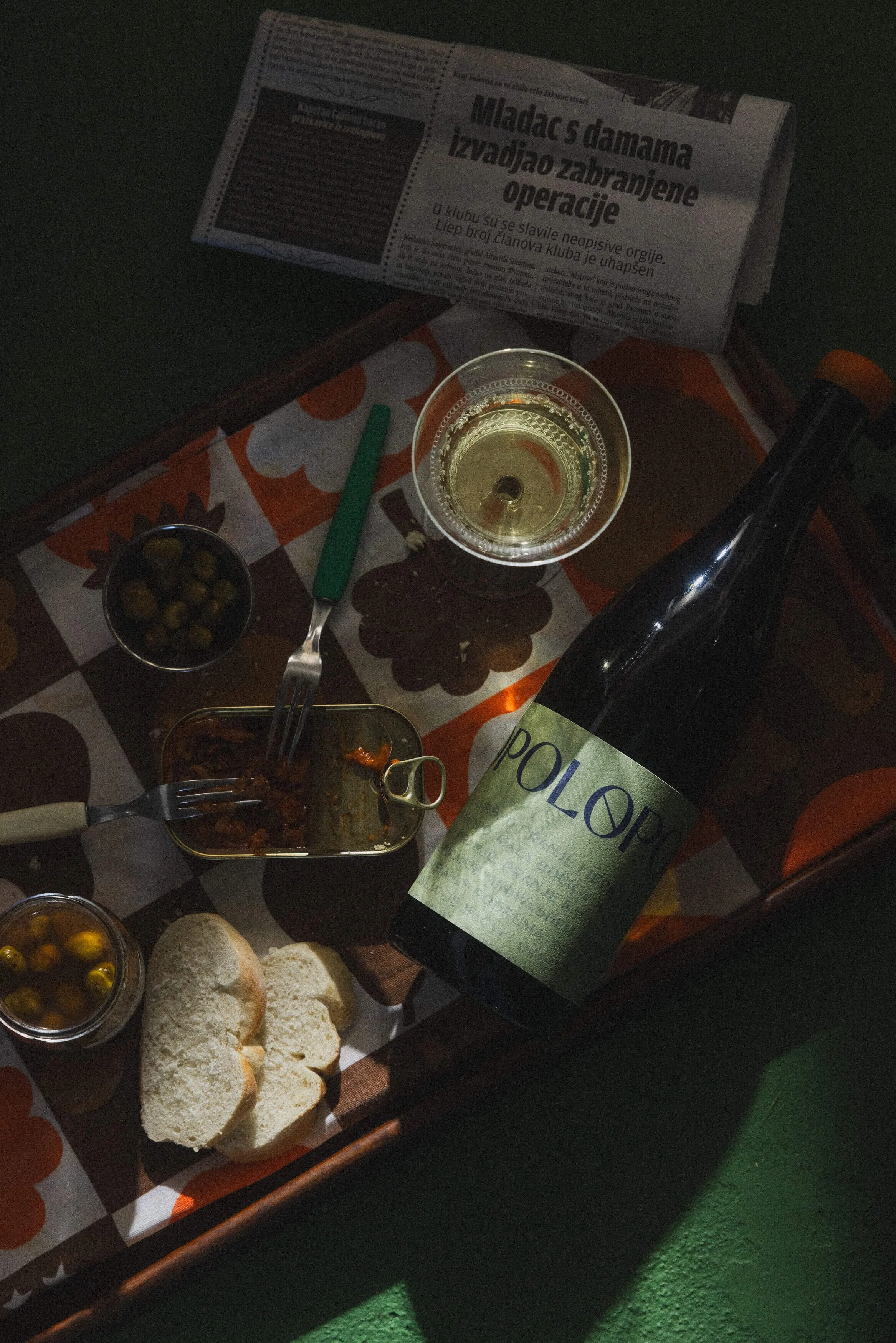
The aesthetic of the bottle and photo set design is reminiscent of old, unpretentious bistros and taverns with checkered tablecloths, serving simple food with homemade wine — the kind that used to be present all over the Mediterranean, along the roads that led both somewhere and nowhere.
Winemakers & brand developers: Željka Zrnić, Dora Perharić
Creative direction & set design: Željka Zrnić, Dora Perharić
Graphic design: Tea Bilić,
Photographer: Ino Zeljak
Year: 2025